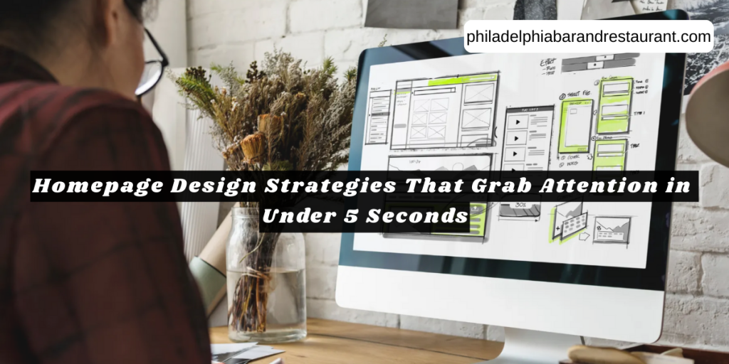
Homepage Design Strategies That Grab Attention in Under 5 Seconds
Your homepage has about 5 seconds to convince visitors they’re in the right place. If it doesn’t grab attention within that moment, they’ll leave and check out one of your competitors instead.
Let’s be honest here. Restaurant and bar websites compete with hundreds of other options online. That’s why, when someone lands on your site, that first impression decides everything. If your homepage looks outdated, loads slowly, or confuses people about what you offer, you’ve already lost them. At PBR Web Design, we see this happen more often than you’d think.
That’s why we put together this article on homepage design tips that actually work. We’ll also cover
- Patterns that keep visitors engaged
- Mistakes that send them running
- The simple fixes that make a real difference for hospitality businesses.
So, let’s get started.
Why Homepage Design Makes or Breaks First Impressions
A well-designed homepage keeps visitors on your site, while a poor one sends them straight to your competitors. That’s how the first impression builds trust about your website.
If you are still confused, here’s what happens in those first few seconds and how it impacts your services.
The 5-Second Rule in Web Design
Based on our firsthand experience with restaurant clients, people form opinions about websites within 5 seconds of landing on the page. Sometimes it happens even faster than that. This is why your homepage needs clear messaging, appealing visuals, and intuitive navigation during this window.
It’s natural that when visitors can’t quickly understand what your bar or restaurant offers, they’ll bounce to a competitor’s site. At that time, they are not even concerned with how good your menu or food offerings are (and yes, bounce rates hurt more than you’d think).
Poor User Engagement Can Cost You Customers
Generally, poor homepage design leads to high bounce rates. That means visitors leave your site without exploring other pages or checking out what makes your venue special.
But the larger effect doesn’t stop only at bouncing away. When users feel confused, they won’t book tables, browse your drinks menu, or engage with your offerings at all. So, it costs you a lot because lost engagement translates directly to lost revenue and missed opportunities for your business growth.
Restaurant Website Design That Speaks Before You Do
What if your homepage could tell visitors exactly what kind of experience they’ll have before they read anything? You might be wondering how that’s even possible. In reality, it’s possible by mixing visual hierarchy and brand identity together.
When someone lands on your restaurant website, the colours, fonts, and images communicate your brand’s personality instantly. For example, a cocktail bar with dark, moody visuals sets different expectations than a bright, family-friendly venue.
And we’ve seen that visual branding creates instant recognition. It also sets expectations for the dining or drinking experience you offer. That’s why your homepage elements like hero images and taglines should match the actual atmosphere diners will experience.
Verdict: If your site promises a lively atmosphere with energetic food photography but your venue delivers a relaxed, quiet environment, that disconnect confuses potential customers. So, keep your homepage honest and aligned with what you actually deliver.
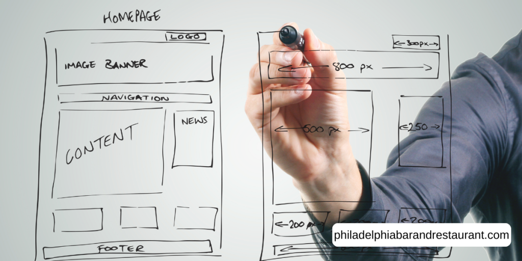
Homepage Design Tips: What Truly Works
Clear navigation, fast load times, and mobile-friendly layouts truly work better than fancy animations or complex features. These basics also create successful bar and restaurant websites that never frustrate visitors.
Let’s break down these elements in detail for your better understanding.
Clear Navigation and Easy Access to Key Pages
Through our practical work with hospitality websites, we’ve seen that restaurant and bar sites need prominent menu buttons, reservation links, and contact details right in the header area. You should also place them in that specific place on your homepage so that your visitors don’t have to work hard to find them.
You can also say it like you should place that information two clicks away on your homepage. This placement ensures easy access to your food menu, drink offerings, upcoming events, and location.
Quick tip: Adapt a simple and intuitive navigation for your homepage to reduce visitors’ frustration and keep them exploring your site rather than leaving early for a competitor.
Visual Hierarchy That Guides the Eye
Strategic placement of headings, images, and buttons directs attention to your most important information first. Plus, larger text, bold colours, and breathing room help users scan your homepage and find what they need.
That’s where good visual hierarchy feels natural. When you use it properly, your visitors don’t have to work hard understanding your layout or figuring out where to look next.
Fast-Loading Elements Your Restaurant Website Needs
Slow-loading homepages frustrate visitors and affect your search engine rankings with Google’s algorithms (we’ve all rage-clicked a slow site before). Here, optimised images, clean code, and reliable hosting ensure your site loads in under 3 seconds, solving the issue.
Basically, loading speed directly impacts whether visitors stay on your page or abandon your website before seeing your food offerings, drinks menu, or special events. That means if your homepage takes 5+ seconds to load, you’re losing customers before they even see what you offer.
Common Mistakes That Kill Your Website Design
Even the most beautiful restaurant and bar websites fail when they make these common homepage design mistakes. Believe it or not, we see these issues arise on hospitality sites most of the time.
Now, let’s have a look at what these mistakes are actually costing :
- Cluttered Layouts: When your homepage tries to showcase everything at once (food menu, drinks offerings, events, venue photos, customer reviews), users don’t know where to focus. That’s how, too many competing elements confuse visitors instead of guiding them toward booking a table.
- Buried Contact Information: If visitors have to scroll through three sections or browse multiple pages to find your location, phone number, or booking link, they’ll give up. That’s why, put these details in your header where people can spot them immediately.
- Auto-Playing Media: Music or videos that start automatically drive visitors away faster than almost anything else. It’s because nobody wants surprise sounds blaring when they land on your site, especially if they’re browsing at work.
- Mobile-Unfriendly Designs: Most restaurant and bar searches happen on phones now. So, if your website does not work well on mobile devices, potential customers will leave quickly. Many of them will choose competitors that offer a smoother mobile experience.
Caution: Always be careful about these mistakes. Because any one of these can tank your engagement and send visitors straight to your competitors’ sites.
Ready to Redesign? Start With These Homepage Essentials
Your homepage doesn’t need a complete transformation to start seeing better results from visitors today. Small, focused changes often make a significant difference for restaurant and bar websites.
That’s why focus on fixing the biggest issues first. Use clear, easy navigation rather than flashy animations. Keep your site fast-loading, since it keeps people on your site instead of bouncing away. Most importantly, ensure mobile responsiveness because the majority of users search on their phones.
Test your changes with real users and track metrics like bounce rate and time on site. If you still need help creating a homepage that actually converts visitors into customers, reach out to PBR Web Design. And let’s build something that works for your venue.